
Claude Dashboards and Claude Motion: a hands-on test, and the bug that only the formula panel showed
What Claude Dashboards built from 88 rows of public Wikipedia data, which of its numbers held up against the source file, and why the one thing it got wrong will be invisible to most people who look at a shared dashboard. Plus who sees what when you share one, and how Claude Motion makes video without a video model.
On October 8 Anthropic put two new artifact types into beta. Claude Dashboards turns a question about your data into a set of charts that refresh as the data changes, with the query behind each chart one click away. Claude Motion turns a report or a walkthrough into a short animation that Claude writes as code and you export as an MP4.
Video: Anthropic's announcement on X.
The launch post passed 28,000 likes within hours, and the replies I read had almost no hands-on reports. Motion is limited to Team and Enterprise plans, and Dashboards is built around connected data sources. So I built a dashboard on a Max plan from a public CSV and checked every number it gave me against the file.
The charts were right, and the model was more careful than I expected. What it got wrong was a definition: how to tell whether a month is complete. Nothing on the dashboard showed it. The panel that lists each chart's formula did, and Anthropic deserves credit for putting it there, because you will need to read it.
What are Claude Dashboards and Claude Motion?
Both are artifacts made from a template, the same mechanism behind Claude's Docs, Slides and Design, which left beta on every plan the same day.
A dashboard, in Anthropic's words, is one where "Claude writes a SQL query for each chart and runs it against your data source. Each chart shows its query, so you can see exactly what it's counting, along with when its data was last refreshed." Anthropic pitches it for "quick, exploratory questions, like how this week's signups compare with last month's." For deeper work you can send the dashboard to Amplitude, Grafana, Hex, Mixpanel, Omni, Perplexity, PostHog or Sigma, with Looker, monday.com and Tableau listed as coming soon. Dashboards is in beta on Pro, Max, Team and Enterprise.
Motion is narrower. It "turns your content into short animations, like an explainer for an all-hands, an animated chart for a board deck, or a product walkthrough for customer onboarding," on Team and Enterprise only. Both count toward normal usage limits, and no separate price is mentioned.
For companies the defaults matter. Per the admin guide, both are off by default on Enterprise until an owner turns them on, and Motion is on by default for Team. In HIPAA-ready organizations they can be enabled, but they "aren't covered under your Business Associate Agreement (BAA), so keep protected health information (PHI) out of them."
How does a Claude Dashboard get its data?
The intended path is a connector. The launch article names Amazon Redshift, BigQuery, ClickHouse, Databricks and Snowflake, plus your other connected apps, with Salesforce as the example. In the Claude directory, four of those five are third-party MCP connectors, untrusted authors like any other, each carrying Anthropic's standard warning that it "cannot verify that they will work as intended." The Databricks entry is Databricks' Genie connector, which writes its own SQL. That doesn't quite fit "Claude writes a SQL query for each chart," and the docs don't say which path Dashboards uses there.
Metric definitions are the obvious worry with any generated query. Anthropic told The New Stack that Dashboards "will also support these semantic models if they are exposed through a connector," meaning dbt-style definitions your data team already maintains. Whether a team can force every dashboard to use them, rather than letting Claude write its own, isn't stated.
"Live" is the word doing the most work in the announcement, and the documentation is thin on it. The launch says the dashboard "updates as your data changes," and each chart shows when it was last refreshed. I found no page that says what triggers a refresh. The only refresh mechanism Anthropic documents is in the Claude Code artifacts docs, for connector-backed pages, which fetch data on load and "can refresh on an interval or when a viewer uses a refresh control," with responses cached in the viewer's browser. Dashboards probably use the same runtime, but that is my inference.
What the docs don't mention is files. Paste a CSV into the dashboard's chat and you get a dashboard, which is how I tested it. The data then lives inside the artifact rather than in a warehouse. That changes two things I come back to below: the formulas in my dashboard were JavaScript instead of SQL, and the data goes wherever the dashboard goes.
What did Claude Dashboards build from public Wikipedia data?
I pulled monthly English Wikipedia pageviews for four articles, Pizza, Sushi, Ramen and Taco, from the Wikimedia pageviews API, counting human readers only, from January 2025 to the day of the test. That is 88 rows. The last month, October 2026, held only eight days of data, and I didn't mention that. I opened a blank dashboard from the Artifacts page, pasted the CSV, and asked for what a normal user would ask for:
I want: a line chart of all four over time, a ranking of which food got the
most attention overall, and headline numbers including the most-viewed food and
each food's change in the latest month versus the month before. Point out
anything interesting, like seasonal spikes.
About four minutes later, on Opus 5.5 at medium effort, this is what it built:
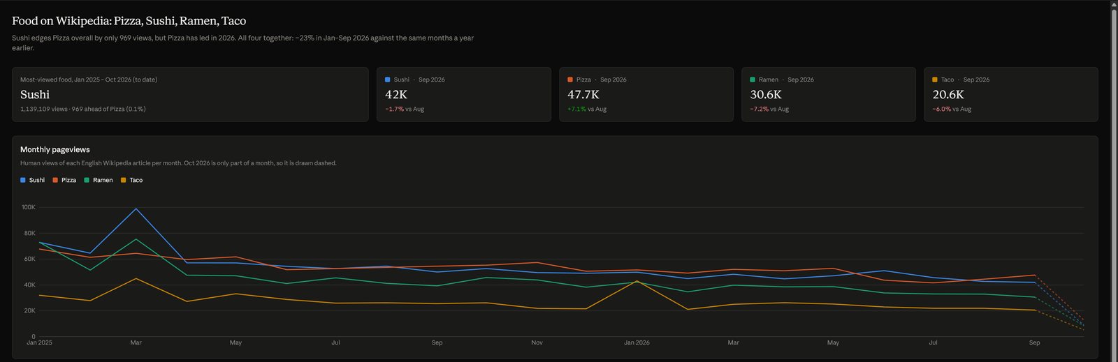
The dashboard Claude built. October 2026 is drawn dashed and labelled "to date".
The "latest month" request was a trap, and Claude stepped around it on its own: "October 2026 only has about 8 days of data, so a straight October vs September comparison would show every food down 73–79%. The 'latest month' tiles compare September with August instead." It drew October dashed and said so in the chart's caption.
Then I checked every figure against the CSV. All of them were right: Sushi ahead of Pizza overall by 969 views out of about 1.14 million each, Sushi winning 2025 by 22,734 and Pizza leading 2026 by 21,765, September against August at +7.1% for Pizza and −7.2% for Ramen, the March 2025 peak at 99,075 for Sushi, Taco doubling in January 2026 and falling straight back. It also noticed something I hadn't asked about. Together, the four articles drew 23% fewer views from January to September 2026 than in the same months of 2025, with drops from 16% for Taco to 30% for Ramen. It suggested a cause and flagged the gap in its own evidence: "Since all four fell together, I'd read it as fewer people reading Wikipedia rather than a change in taste. ... I didn't check whether either one explains a drop this large."
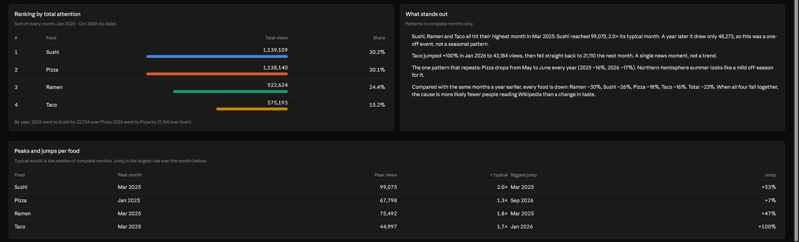
The ranking, the findings panel and the peaks table. Every number here matches the source file.
The prose stretched further than the numbers did. It called Pizza's May-to-June dip "the one pattern that repeats ... every year" from two years of data, labelled the March 2025 spike and Taco's January jump as one-off news moments without knowing what happened, and predicted Pizza would take the overall lead "within about a month." A careful reader would discount all three. Someone skimming a shared dashboard might not.
Where did the Claude Dashboard go wrong?
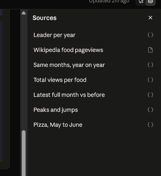
In a place no chart showed. Every chart and tile comes from a named source, and the Sources panel lists them. With a file instead of a warehouse, my dashboard had one data file and six computed sources, each with a plain-language description, a formula, and its result.
The source behind the "latest month" tiles was described as "the last month that has ended, against the month before it. The current month is left out because it is not over." Its formula started with new Date(). It decided which month was complete by looking at today's date, not at the data.
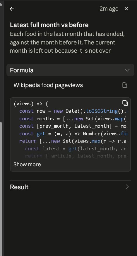
On a dashboard connected to a warehouse that keeps filling up, that would be the right rule. On my file it isn't, because the file is a snapshot that stops on October 8. Claude had told me the tiles would "update on their own." So I asked what they would show on November 2 if I never sent a new file:
On November 2 the tiles will be wrong. What I told you was misleading,
because the dashboard can't tell that October's data stops on about the 8th.
It listed what would break if the dashboard were opened then: the tiles would compare eight days of October with all of September and show every food down 73% to 79%, the dashed partial segment would turn solid, and the year-on-year comparison would show −28% instead of −23%. It proposed a fix, a data_through column plus a visible "Data through Oct 8" line, and asked whether to apply it. I didn't, so the fix is untested.
That is a good answer, and it came only because I read the formula and asked. The model handled the partial month it could see in the data. It wrote logic for live data on top of a static file, and nothing on the page says which of the two you are looking at.
I saw a similar pattern in an earlier run on a private analytics export, which I won't show here. A column the export labelled "views" actually counted visitors. Claude flagged the mismatch on two of the three tables, missed it on the third, and built its headline percentage on mixed units. One sentence from me, and it fixed the number, relabelled every column and withdrew a second claim it had built on the same mistake. Both errors sat in definitions, a unit in one case and a period in the other, not in arithmetic.
So the "every chart shows its query" design matters more than the charts. A dashboard is only as right as its definition of a month, a visitor or a revenue line. A few BI people in the launch replies asked whether a team can pin an approved metric definition so that two valid queries can't disagree. Semantic-model support through connectors is the closest thing to an answer so far.
Who sees what in a shared Claude Dashboard?
For connector-backed dashboards, each viewer runs the queries with their own access. An Anthropic spokesperson told The New Stack: "When you share it, each viewer's own connections run its queries by default, so people see only data they already have access to." The sharing help page agrees: "If a viewer can't access a data source, that part of the artifact shows an error instead of your data." Two people opening the same link can see different numbers. That protects permissions, and it undermines a meeting where everyone is supposed to be looking at the same chart. "By default" suggests another mode, and no page I read describes one.
Public links are where Anthropic's own pages disagree. The launch article says you can share dashboards "with anyone who has the link, if your admin allows it." The admin guide says "Artifacts that use connected apps, or that ask Claude questions, can't use 'Anyone with the link.'" The Claude Code docs, for a different surface, say an outsider who opens a public link "sees the page without its live sections." For a connector-backed dashboard, the safe reading is that the live parts won't reach anyone outside your organization. Viewers also need a Claude account to open a shared artifact at all, link or not.
A file-based dashboard is the opposite case. Mine offered "Anyone with the link" in the share menu, and Claude pointed out that the CSV is attached as a source: "Anyone who can open the dashboard can read that file too." If you build a dashboard from an export and share it widely, you share the export.
What is Claude Motion, and why is it code instead of video?
Motion makes animations, not footage. Anthropic's help article: "Claude Motion doesn't use a video generation model, so it doesn't create realistic footage or people. Because each animation is code, you can change one detail, like a word, a number, or the timing, and the rest stays as it was." You edit by asking ("Change the Q3 number to 18%") or in an editor, and export as MP4, the only format named. Anthropic lists hand-offs to Adobe, Descript, HeyGen, Higgsfield, invideo, Luma AI and Runway.
An Anthropic designer, Nate Parrott, said on X that Motion exists because people noticed Opus 5.5 was already good at animated explainers and data visualizations, and the team put "lightweight UI on top." The New Stack notes that developers had been making similar videos with Claude Code and frameworks like Remotion. Motion moves that into the Claude app, for people who will never open a terminal.
I couldn't test it. On a Max plan the artifact templates were Docs, Slides, Design and Dashboard, with no Motion. The docs leave basic questions open: maximum length, resolution, frame rate, audio, captions, and which model writes the animation. One is worth checking before anyone relies on it. On the Claude API, video files Claude produces in the code execution sandbox and downloads through the Files API carry C2PA Content Credentials, and Anthropic's marking policy covers files made in the Claude apps "where supported." Nothing says whether a Motion export is one of them. If it is, any tool that re-encodes the file or strips its metadata on the way to a video editor removes the credential, per Anthropic's own docs.
How does Claude Dashboards compare with ChatGPT's data agent?
OpenAI shipped its version a month earlier. Its data agent in ChatGPT Work connects to much the same warehouses and "builds interactive dashboards you can share," and "queries enforce the connected account's existing permissions, including table, row, and column restrictions." It can also build dashboards inside existing BI tools such as Power BI and Tableau. The difference is in what it publishes. OpenAI's help article says that for dashboards published as a site, "the data used in the analysis is copied into the published site." Claude's connector-backed dashboards don't copy the data into the artifact. Each viewer's access decides what loads.
Neither is simply better. OpenAI's choice gives everyone the same numbers and puts the burden on whoever publishes. Anthropic's keeps permissions intact and makes "the same dashboard" mean different things to different people. With a file source, Claude ends up on OpenAI's side of the line, because the file travels with the dashboard.
Should you use Claude Dashboards or Claude Motion yet?
Use Dashboards for the job Anthropic describes, quick questions you would otherwise put in a ticket, and treat each chart as a draft query. Before you share one, open the Sources panel and read the descriptions. Check how a period counts as complete, what unit each count is in, and whether anything depends on today's date while the data doesn't. In my test the model handled these well when the problem was visible in the data and missed them when it wasn't, and it was candid about the gap as soon as I asked.
Don't share a file-based dashboard more widely than you would share the file. And don't treat a connector-backed one as a single source of truth in a room where people have different access.
Motion is for Team and Enterprise users who already make the kind of explainers it targets. The architecture is what interests me. Because Claude writes the animation as code, a wrong number can be changed without regenerating everything around it. The same property made the dashboard's mistake findable: the output is something you can read.
